Homepages are like digital welcome signs that greet the people who visit your website. Just like your storefront, they should be professional looking, inviting, attractive, clean, neat, and functional. Having a good design is a great place to start, but that is usually not enough. In this article, we will look at some elements you can add, change or tweak to make your homepage more effective.
Keep the Layout Clean and Clutter-free

With so many web design trends coming and going, it can feel like you need to add every element that these trends advocate for. Keeping the homepage clean and clutter-free can get you much further than adding everything you can.
This is because a website that is too busy is confusing for visitors, and it increases the chances of them bouncing early. Instead, keep the amount of textual and visual content as low as you can. This will help you look more professional and organized.
If your site serves one function, let visitors know as soon as they get on the homepage. A page like Unscramble.me’s homepage lets visitors know what the website is for and what is expected of them. This removes confusion and makes the homepage much more functional.
Ensure it is Always Up to Date
Stale content can make you seem like you do not care. It can be a good idea to advertise special holiday offers on the homepage but remove them as soon as the holidays pass. This goes for other types of content like news, products, and even developments in your business. Ensure your website is always up to date and your visitors receive fresh content regularly. Schedule a weekly or monthly reminder to check the website to remove stale content.
Add a Clear and Obvious Call to Action

Ask yourself what action(s) you want your visitors to take when they visit the website. A call to action tells them to take that action and sets expectations for what you expect them to do when they visit the website. Some common types of calls to action include asking people to sign up for a newsletter, shop on the ecommerce section or fill out a form. Adding a clear and obvious call to action will make your homepage more effective as it becomes a lead generation and conversion tool.
Use High-Resolution Photos
There are both pros and cons to using high-resolution photos. For example, these photos tend to be larger and heavier which can slow down your website. However, with technologies like compression, caching and content delivery networks, you can ensure your website is fast even when you use such images.
Their main advantage is that they let visitors know what you are about. They make your website look more professional and well put together. They can also create intrigue that causes your visitors to take action or visit other pages on the website.
Work with a Consistent Color Palette

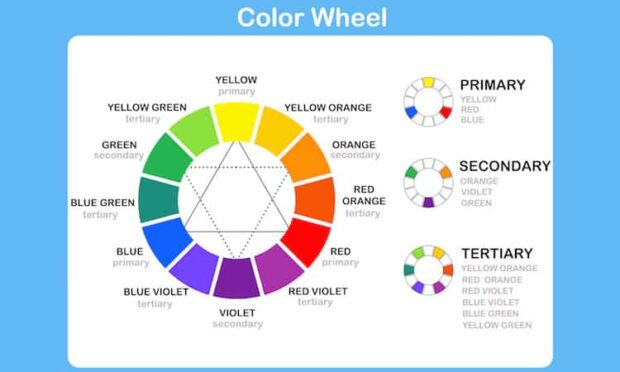
Color palettes are crucial in web design because they help designers ensure design consistency. They take care of things like background, font, and accent color for a consistent and cohesive look. Use the color pallet consistently throughout the homepage to make it look more professional. You can also use the color palette to let your brand shine through your website. This helps with brand recognition. Always test your color palette to ensure it and the design elements it is used on do not cause any legibility issues once the homepage is done.
The homepage is one of the most important pages on your website. You want it to look professional because it is one of the first things to see when they interact with your brand. Its homepage’s design is crucial, and you need to ensure it is effective at getting you the results you need.


